It billows out like a flag at the slightest touch. Like a flag, it also has a design on it.
What kinds of hairstyles does a Eunicorn like?
Click on an image to see!
Bright College Years (animated short film)
2024
Story, Animation, Character and Environment Design, and Production by me
Best Animated Film at the Yale in Hollywood Film Festival 2024
Shown in the Yale Schwarzman Center's YouTube channel, building screens, social media, and newsletter campaign for the class of 2024's graduation.
Video animated with Adobe AfterEffects, edited with Premiere, VFX and digital drawings with Photoshop.
ZZZ
2022
Story, Animation, Character and Environment Design, Soundtrack, and Production by me
Shown on Times Square billboards at 41st St and Broadway on December 15th, 2021
This animated short film is made of shadow puppets in 12 fps stop-motion. I cut black and white paper, pinned joints together, and put them on a lightbox. Then, I took a photo, moved the puppets a bit, took a photo, moved them a bit... Every second is 12 photos. Finally, I combined sound effects and my voice acting with the visuals.
There are all sorts of ways to wake up a mummy to go to school. Which method do you think is the best? Understanding what motivates the other person is likely the most convincing.
Yale Schwarzman Center LunarFest
2024
I created introductory, interstitial, and ending motion designs for a promotional video using the Yale Schwarzman Center's branding guidelines and LunarFest's design assets.
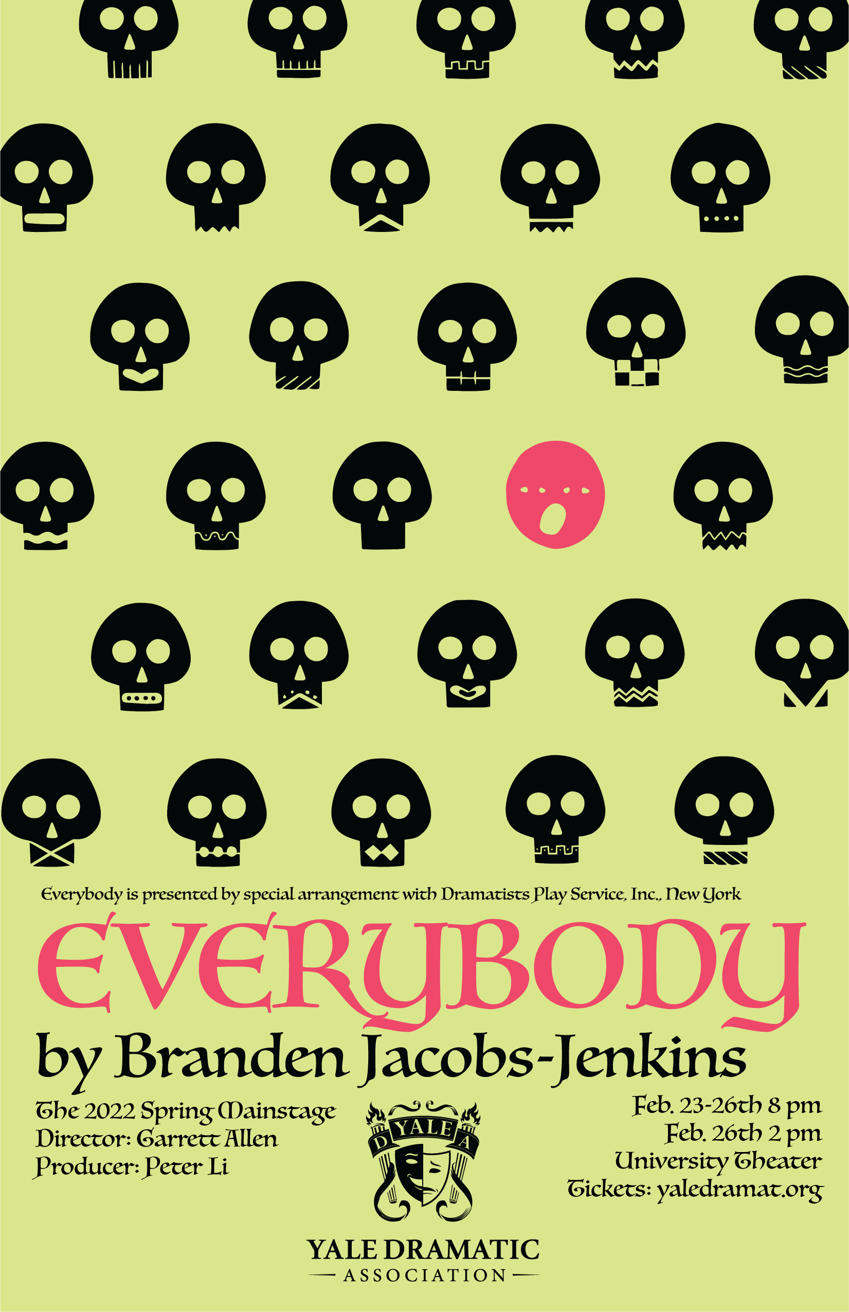
In the play, the main character, called Everybody, whose actor is determined by lottery during the performance, searches for someone or something to accompany them to death. To convey the randomness of being chosen to die, I made two posters with inverted colors and many varying skulls or human heads creating a crowd effect. There are many diverse people in the world, but only one (love) will accompany Everybody to death. Therefore, I highlighted one skull among human faces or one face among skulls with the same color as "Everybody". The tie between the bright complementary colors pink and green suggest how the play gives the usually feared death a touch of whimsy and humor and celebrates love.
Poster for Yale Dramatic Association Spring Mainstage Everybody
2022
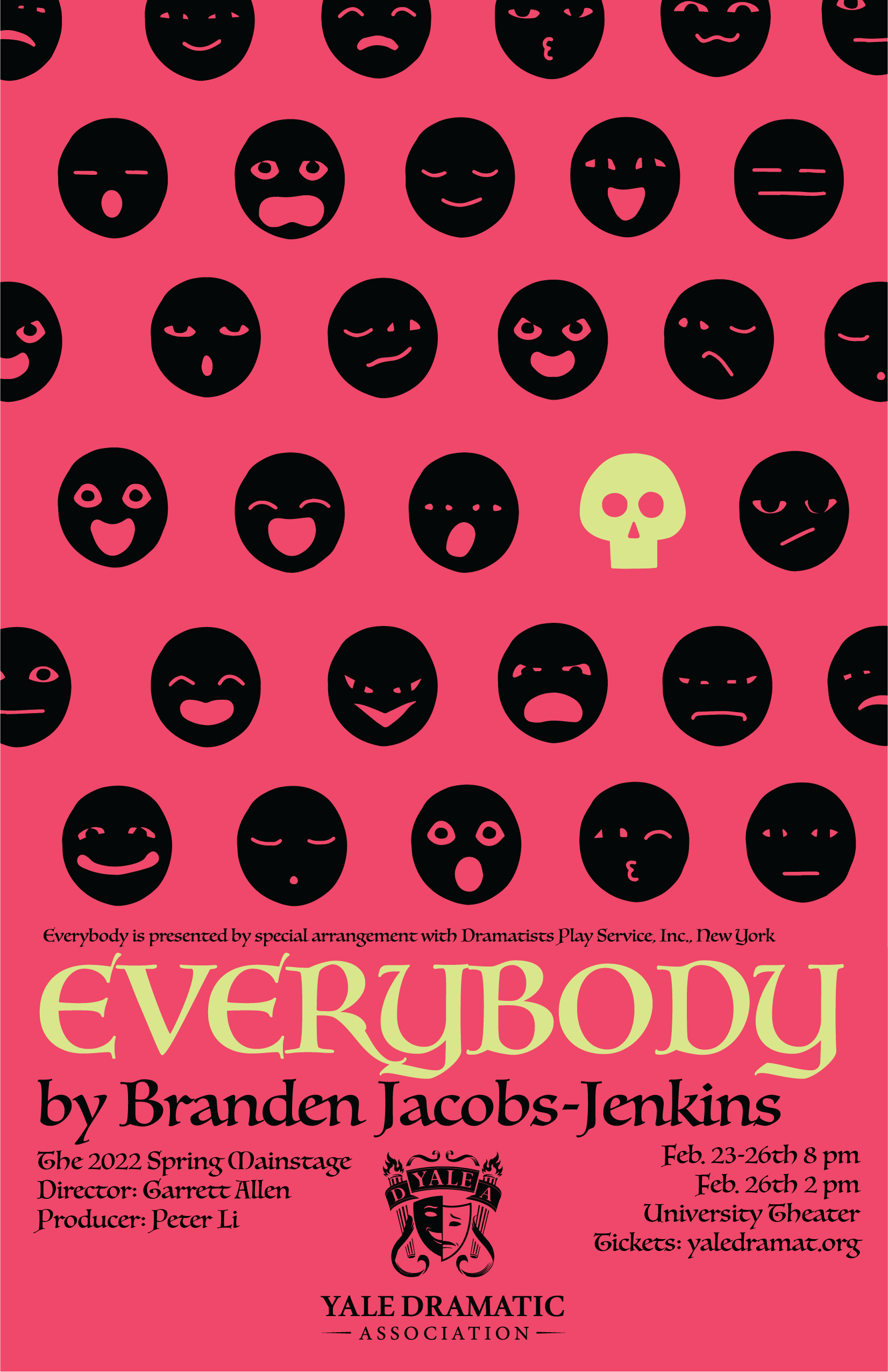
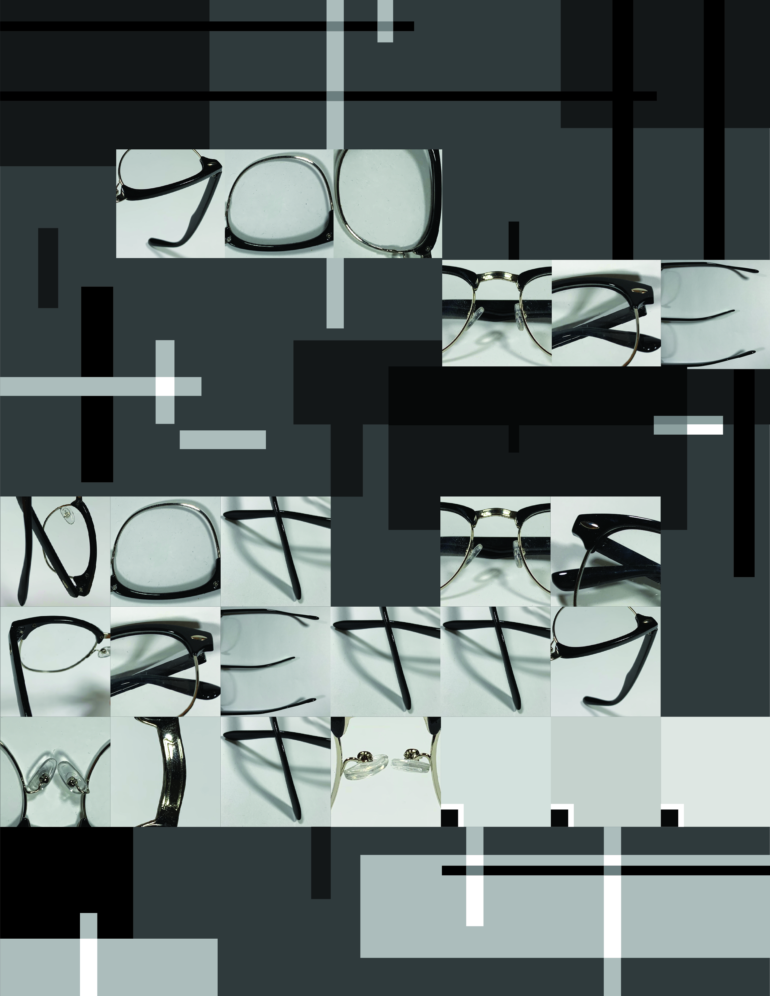
I designed a font using letterforms found in the shapes of one pair of glasses, and used it to make a poster saying "Not As Pretty With..." which prompts the viewer to fill in the blank with the glasses in the font or another insecurity. I was inspired by the connotations of seeing and beauty in glasses, which my mother often told me that I'm not as pretty with. Black, grey, and white lines and a dark background contrast with the font's organic forms and white background while matching its color scheme and rectangular strip structure. A high concentration of dark values form a serious atmosphere, and the translucent lines mirror the transparency of glasses lens, to further the theme of criticizing how the way beauty is viewed causes insecurities.
Not As Pretty With...
2022
I designed a font using letterforms found in the shapes of one pair of glasses, and used it to make a poster saying "Not As Pretty With..." which prompts the viewer to fill in the blank with the glasses in the font or another insecurity. I was inspired by the connotations of seeing and beauty in glasses, which my mother often told me that I'm not as pretty with. Black, grey, and white lines and a dark background contrast with the font's organic forms and white background while matching its color scheme and rectangular strip structure. A high concentration of dark values form a serious atmosphere, and the translucent lines mirror the transparency of glasses lens, to further the theme of criticizing how the way beauty is viewed causes insecurities.
Glasses Font
2021
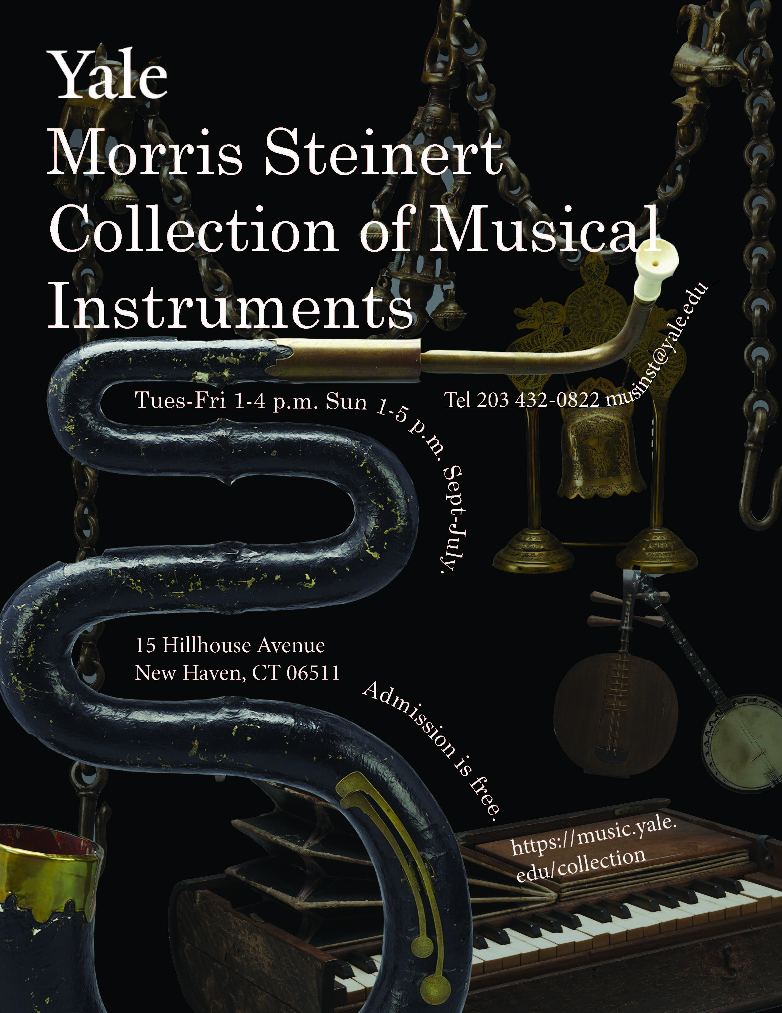
When designing these promotional materials for the Yale School of Music's collection of musical instruments, I was fascinated by how similar instruments all around the world take on myriad forms to produce unique sounds and beautiful music, which is deeply connected to humans' emotions, cultures, and experiences throughout history. I combined instruments into abstract compositions on the 2 posters and outdoor installation to showcase the intriguing shapes, cut postcards into the instruments' silhouettes, designed shopping bags that allow visitors to feel the instruments' shapes and textures in 3D, and revealed decorative details in 4 social media images. Since I was working with Yale, I united its pre-existing identity with my ideas by setting a lockup and using the Yale official font, logo, and colors.
Poster for Morris Steinert Collection of Musical Instruments
2022
When designing these promotional materials for the Yale School of Music's collection of musical instruments, I was fascinated by how similar instruments all around the world take on myriad forms to produce unique sounds and beautiful music, which is deeply connected to humans' emotions, cultures, and experiences throughout history. I combined instruments into abstract compositions on the 2 posters and outdoor installation to showcase the intriguing shapes, cut postcards into the instruments' silhouettes, designed shopping bags that allow visitors to feel the instruments' shapes and textures in 3D, and revealed decorative details in 4 social media images. Since I was working with Yale, I united its pre-existing identity with my ideas by setting a lockup and using the Yale official font, logo, and colors.
Postcards for Morris Steinert Collection of Musical Instruments
2022
The font Modula by Emigre reminds me of Hong Kong's MTR subway maps, which are deeply engraved in my childhood memories. Please feel free to read the poster to find out why!
Modula Type Specimen Double-Sided Poster (Front)
2022
As an Undergraduate Student Coordinator on the Communications and Design Team at the Yale Asian American Cultural Center, I designed this poster for all us staff to be posted in the AACC building.